
Smart Entry Systems Console Interface Redesign
Project Duration: 4/19/2024 — 5/17/2024


The context
The problem
The Solution
My Role
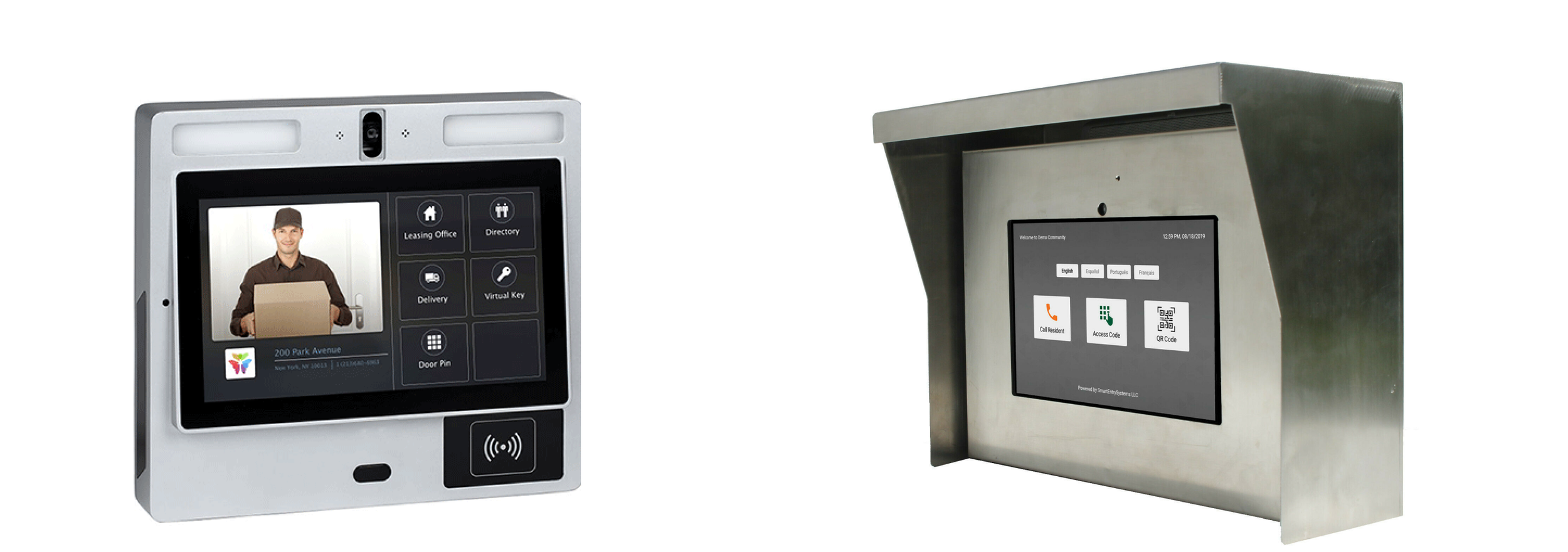
Smart Entry System is based in Miami, FL. They are developing a complete access control solution for gated residential communities, apartment buildings, and other types of multi-tenant properties to manage both their visitor and resident entry access. They are supporting tens of thousands of residents at the moment.
The platforms they use to interact with users include mobile app (where residents can set visitor access permissions and book community facilities), website (where community managers handle resident information and permissions), and console (placed at the community entrance to confirm visitor access permissions). The console product is particularly highlighted during each bid to the community HOA to nail down the final sales contract, making its UX design crucial. Therefore, my main focus for this project is to identify issues with the console interface and provide visualized solutions.
The primary challenge is to redesign the user interface of the Smart Entry Systems' console.
Here are three "How Might We" (HMW) questions to address challenges:
How might we design the console's user interface to guide first-time visitors through the process of accessing the facility, ensuring they can quickly and effortlessly understand the available options?
How might we modernize the console's aesthetic and functionality to make it stand out in competitive bids and exhibition shows, aligning it with the latest trends in smart technology?
Through efficient collaboration with the product manager, we quickly developed a solution that incorporates a user-friendly interface with intuitive navigation and clear visual cues for first-time visitors. This solution includes a redesigned digital keypad with larger, clearly labeled buttons and enhanced contrast for better visibility, a streamlined process for accessing the community or apartment via QR codes or direct calls, and a modern aesthetic that aligns with current technological trends, making the console more competitive and appealing in exhibition shows and HOA bids.
In this project, I worked with product manager and frontend engineer. My role as a UX designer was to ensure that the console tablet interface is intuitively usable, visually appealing, and accessible. I redesigned some of their key screen to improve the fluency of use and modernity of the design .

Dive into user needs and stakeholder goals

Cooperation: In my first meeting with the product manager, we discussed in detail the users' needs and the outcomes he wanted to achieve through the design. I asked him about any known complaints or suggestions from past user surveys. These information provided a solid foundation for my design process on the user experience.
Understanding User Needs:
The console is typically placed at the entrance of gated residential communities, apartment buildings, or commercial complexes, acting as an interactive access control call box. Regular residents generally do not need to use it as they can access using their access cards or fobs, or through vehicle detection systems that automatically lift the gate when they drive through. Therefore, the primary users of this console are visitors, many of whom may be encountering this console tablet for the first time. The main goal of its interaction design is to ensure that even first-time users can quickly understand and use the console effectively.
Typically, visitors can gain access by completing one of three tasks through the console:
Calling a resident through the console, with the resident then using an app to remotely open the gate for the visitor;
Scanning a QR code that a resident has provided in advance;
Entering a five-digit code previously given by the resident.
Business objectives:
The console is the primary product showcased at various exhibition shows and HOA bids, and its importance is obvious. Through this design effort, the Smart Entry Systems aims to achieve two main objectives:
Enhancing Competitiveness: In bids, the company faces competition from similar products. An outdated and traditional interface could lead to underestimation in these competitions. The company aims to modernize the console's user interface design to align with the industry’s trend towards technologically advanced and intelligent solutions, thus enhancing the product's competitiveness.
Improving Usability for All Ages: Given the diverse age range of users of Smart Entry Systems, ease of use and understandability are paramount. The company hopes that this redesign will identify areas where product interaction can be enhanced and improved, further optimizing the product for a better user experience.
Heuristic analysis of console interfaces

Cooperation: During my second meeting with the product manager, I presented what heuristic analysis is and showcased its application to our current design. I expressed appreciation for the design’s simplicity and ease of understanding. I also highlighted some areas for improvement. The product manager agreed with most of my analysis. However, when I mentioned that the buttons might be too large, he explained that their size helps prevent input mistakes, especially for older users. I understood and agreed with his rationale, acknowledging the importance of accessibility in real world design.
Heuristic analysis
I used heuristics, such as those defined by Jakob Nielsen, to analysis and find the usability problems in a user interface. For console interface, this analysis involve assessing if it against principles, such as visibility of system status, match between the system and the real world, user control and freedom, consistency and standards, error prevention, recognition rather than recall, flexibility and efficiency of use, aesthetic and minimalist design, and help users recognize, diagnose, and recover from errors.
Key Findings:
Visibility of System Status: The console provide a pop-up window as a feedback after a visitor successfully open the door. But the text is really small and hard to read. Especially when visitors are driving through, they have to reach out from their car to interact with the tablet, which poses less readability due to the distance.
Error Prevention and Recovery: Currently, when a visitor makes an input error or put the QR code in front of console tablet screen instead of camera, the system does not offer helpful suggestions or quick recovery options.
Recognition rather than recall: On the first page, users have the option to select their language. The product manager mentioned plans to add more language options, reflecting the company's global customer base. However, the limited space means that full language names might need to be abbreviated, which could make it difficult for users to recognize and select their preferred language.
By addressing these key issues, the console’s user interface can be made significantly more intuitive, reducing visitor frustration and enhancing overall satisfaction with the Smart Entry System.
Competitor analysis
I conducted research on major competitors of Smart Entry Systems, such as LiftMaster and Butterfly. In comparison, the user interface of Smart Entry Systems does not embody a modern, trendy style, particularly when compared to Butterfly, which has a very technologically advanced and contemporary aesthetic. This insight highlights the need for our system to potentially update its design to align with current trends and meet user expectations in terms of visual appeal and modernity.
Butterfly
Smart Entry Systems
Recommendations for usability improvements

Cooperation: In the meeting, I presented improvement suggestions to the product manager, based on findings from our previous research. To facilitate better communication and understanding, I showcased these ideas through sketches.
Sketch:
In the meeting, I presented improvement suggestions to the product manager, based on findings from our previous research. To facilitate better communication and understanding, I showcased these ideas through sketches.

Brand style guide

Cooperation: In the meeting, the product manager and I finalized the style guide for the product. Throughout this collaborative process, we engaged in thorough discussions to ensure that every aspect of the style guide aligns with both the functional needs and the aesthetic values of the product.
For the Smart Entry Systems' console, which operates on an Android tablet, I've designed the UI elements to align with the brand's personality and the device's technological context. The color scheme includes dark blue and light blue, reflecting the logo's colors and conveying a sense of high-tech sophistication. Red is used to signal errors, enhancing user feedback. The use of the Roboto font provides a clean and contemporary feel, ideal for Android platforms. Furthermore, the UI features bold and large text sizes, tailored to meet users' needs to read clearly from a distance, enhancing overall usability and accessibility.


High fidelity mockups visualized the solution

Cooperation: Building on our previous meetings and communications, the product manager and I have a clear direction for this redesign. During the recent meeting, we discussed the high-fidelity mockups I provided. The product manager was quite pleased with the new design style but also brought up some aspects that I, as the designer, had not considered. For instance, there is a need for high contrast in the design since the console is often placed outdoors at main entrances where it may be subjected to bright sunlight, a low contrast could impair the visibility of information on the screen.
I have redesigned four key screens focusing on enhancing the user experience. Throughout the design process, I also incorporated the product manager's desire to modernize the product's interface.

Added more language options and incorporated national flags as icons to help users more quickly identify their language.
Changed the button labeled "Call Resident" to "Directory" because the console also serves office buildings.
Replaced the digital keypad with a more familiar and intuitive 3x3 grid layout.
Segmented the original elongated input box into five separate boxes, each corresponding to the required number of digits, reducing the likelihood of users entering too many or too few digits.
Upgraded the basic camera screen by adding a focus area along with text and arrow prompts to guide users in proper operation, thereby reducing the time users spend attempting to scan QR codes.
Displayed the successful door opening notification in a larger, bold font to help users see the feedback more clearly.
Design iterations

Cooperation: The iteration review meeting marked our final meeting for this project, where we discussed the recent redesigns with the programmers. During this collaborative session, we went through each element of the redesign, ensuring that all changes were aligned with both the user needs and technical feasibility. The programmers provided insights into the implementation aspects, helping us refine the interface for better performance and usability.
During the design iteration phase for the Smart Entry Systems, I revisited and analyzed the user demographics of the company. Although the company is based in Miami but serves clients globally, its primary users are still in Florida. Noting that Florida has a significant elderly population due to its status as a retirement haven, we reconsidered the digital code input screen. I decided to revert to the original two-row number layout, which features larger buttons preferred and needed by elderly users. I also increased the spacing between the buttons to minimize the chances of accidental presses.
Additionally, screen contrast under sunlight is crucial. I adjusted the color of the pop-up notification for successful door opening to a lighter shade to enhance the contrast with the text, ensuring it's easier to read in bright conditions.
Lastly, I enhanced the design of the error messages to make them more noticeable and informative, aiding in quicker and easier resolution of issues by the users.


Wrap up

As we conclude the Smart Entry Systems redesign project, it's rewarding to reflect on the journey we've embarked upon and the milestones we've achieved. This comprehensive project spanned several phases, from initial user analysis and conceptual design to iterative reviews and final adjustments.
The focus remained steadfast on enhancing usability and accessibility, particularly for our primary user base in Florida, which includes a significant elderly demographic.
Collaboration was at the heart of this project. We engaged closely with product managers and programmers, integrating their insights to ensure the redesign met both business goal and user expectations.
The redesigned Smart Entry Systems is now poised to offer a more intuitive and user-friendly experience, reflecting our commitment to meeting the needs of our diverse user base. This project not only improved the product but also strengthened our team's ability to work effectively across different disciplines and perspectives.