
Prompti App Upgrade: Adding Paid Options to Free Model
Project duration: 2/26/2024 — 3/29/2024


The Context
The Problem
The Solution
My Role
This is a UX design practice I did in Sprinboard, The scenario is that a startup launched a media product two years ago under a freemium model across mobile web, iOS, and Android platforms. While the product has built a robust user base, their current focus is on enhancing the user experience to seamlessly integrate subscription options. The objectives include enabling new users to subscribe during registration and providing pathways for returning users to convert to paid subscriptions.
Within this framework, I envision the evolution of the Prompti app. Serving as a comprehensive hub, it aggregates the latest AI news, premium courses, insightful articles, and vibrant discussions sourced from professionals and enthusiasts alike. Furthermore, it offers a curated summary of online and offline events, enriching the user experience. As it transition towards a premium model, Prompti is poised to elevate its offerings, delivering unparalleled value to its community while seamlessly guiding users towards subscription conversion, thereby unlocking new avenues for growth and monetization.
Based on the project's background setting, the design of the Prompti app must tackle the following challenges:
Enabling new users to subscribe to the premium product during registration. The current signup flow lacks a call to action that allows users to subscribe upon registration.
Providing opportunities for free users to upgrade to paid subscriptions during the sign-in process and within the product interface (post-login). The existing flow lacks prominent calls to action throughout the free experience, thus failing to offer users the opportunity or a compelling reason to subscribe.
After conducting industry leader study and user research, I have proposed several solutions as examples for integrating paid options into the free model of the Prompti app. By enhancing the user flow with clear calls-to-action, users will be prompted to subscribe to the premium product. Seamless integration of subscription options within the existing process and product interface, along with persuasive design elements and discounted onboarding experiences, will further incentivize subscription conversions and foster user engagement.
Solo Designer – Industry leader study, visual/UI style, project plan, sketch, high-Fidelity design, prototype and usability testing.
Understand the current trends and inspired by the best practices
Industry Leader Study
One way that I come up with solutions is by looking at how other teams have solved similar problems. The purpose of conducting an industry leader study is to thoroughly analyze the strategies, methodologies, and innovations implemented by leading companies and professionals in the field. By studying their approaches, successes, and failures, I can gain valuable insights into effective practices, emerging trends, and user-centered design principles.


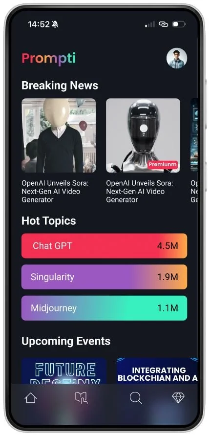
Bold colors and a dark mode are tailored for our young tech-savvy users
UI Style
I opted for bold, gradient colors, and a dark mode for the Prompti app to create a visually striking and immersive experience, inspired by Spotify's transition to dark mode. This choice reflects the brand's desire to stand out and resonate with its youthful, tech-savvy audience, while also acknowledging the trend towards dark mode interfaces for enhanced readability and reduced eye strain, particularly during extended usage periods.


Design is aimless without research, research is meaningless without synthesis
User interview
Affinity map
Persona
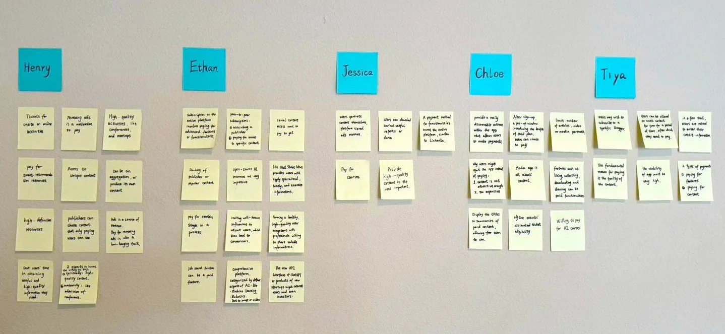
I conducted 5 user interviews with 5 young AI enthusiasts, four of whom work in the internet industry and one in the real estate. User research is particularly important before embarking on design because it provides insights into the needs, preferences, and behavior patterns of the target users. These insights guide design decisions, ensuring that the final product meets user expectations and requirements.
The goal of the interview is to identify key features and design elements that motivate users to upgrade from the free to the paid version of the app. Find a balance between not losing customers by affecting the user experience too aggressively and encouraging users to choose payment methods. Because within the given context it was mentioned that this is a media app, I chose to focus on the direction of the AI community. Therefore, another purpose of this research is to understand what content the user would expect and are interested in from such an app.
Research questions:
What content related to AI do you expect to get?
What motivates you to upgrade to paid versions of apps, give a example?
What barriers or hesitations do you have in upgrading to a paid subscription?
What level of reminders and incentives to pay is appropriate?
What kind of free experience will cause them to abandon the app?
After conducting user interviews, I synthesized my findings through an affinity map. This involved organizing and clustering the insights, observations, and key themes gathered from the interviews into related groups or categories.
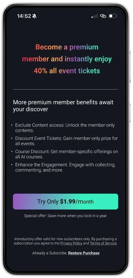
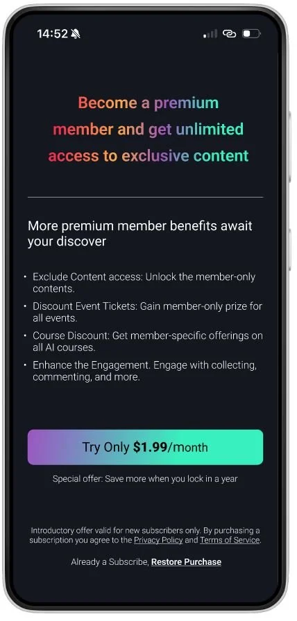
100% of users perceive high-quality content as the primary driving force behind their willingness to subscribe to paid services.
They anticipate accessing the latest news, engaging communities, premium courses, smart recommendation algorithms, and both online and offline AI events through the app.
One noteworthy aspect is that within the given project context, there was an attempt to incorporate prompts for paid subscriptions during the login/signup process. However, all respondents indicated that they have never subscribed to any paid products during the signup/login process. Instead, users are more tend to subscribe after thorough exploration and understanding of the app or when the need arises during their usage experience.

Personas are an essential tool for me to understand and empathize with the users. By focusing on the specific needs, goals, and behaviors of these personas, I can create solutions that are more user-centered, leading to products and experiences that better align with what real users want and need.

Defining key user flows: balancing value and effort
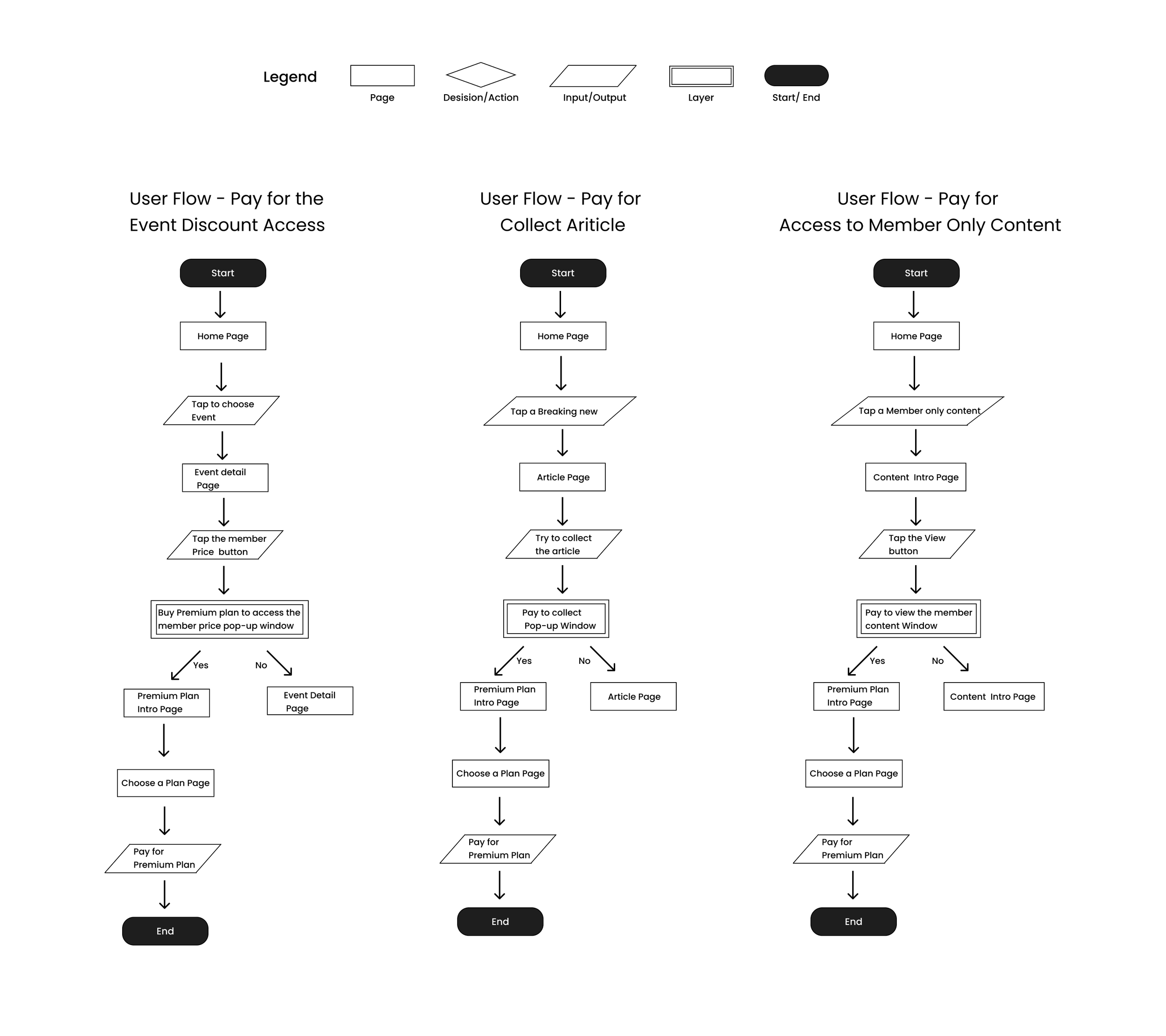
User flow
When defining a key user flow under a tight timeline, it's important to prioritize features based on value and effort, focusing on those that offer the highest benefit with the least effort, while aligning with user needs and business objectives.
Inspired by the research findings, I generated the following potential user payment flows.
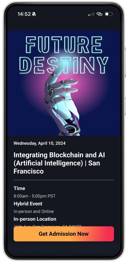
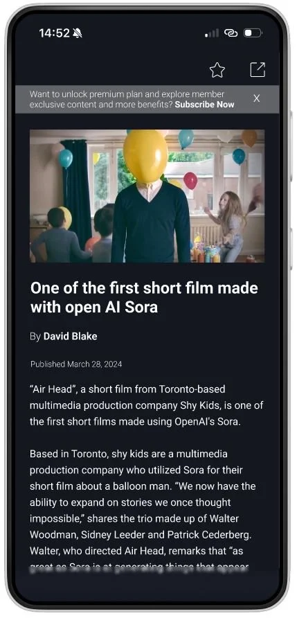
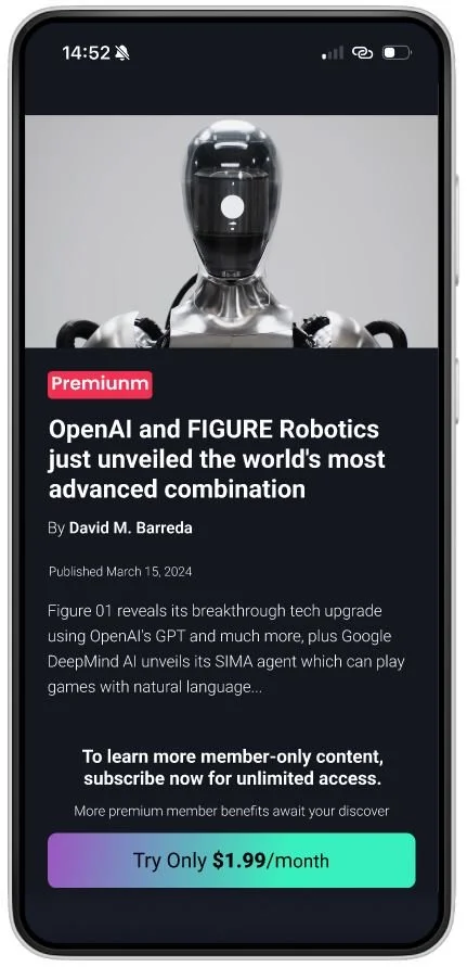
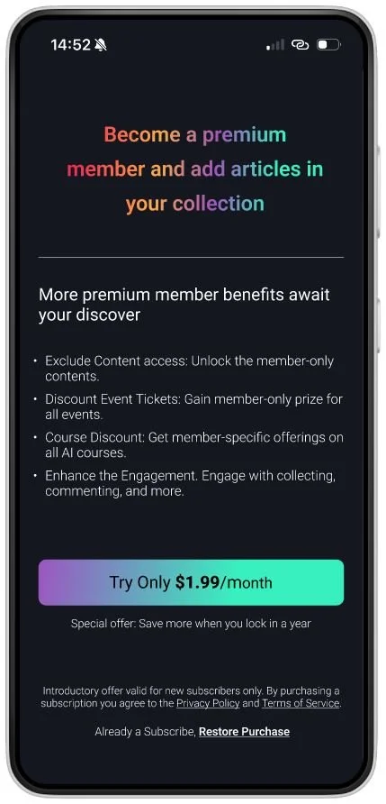
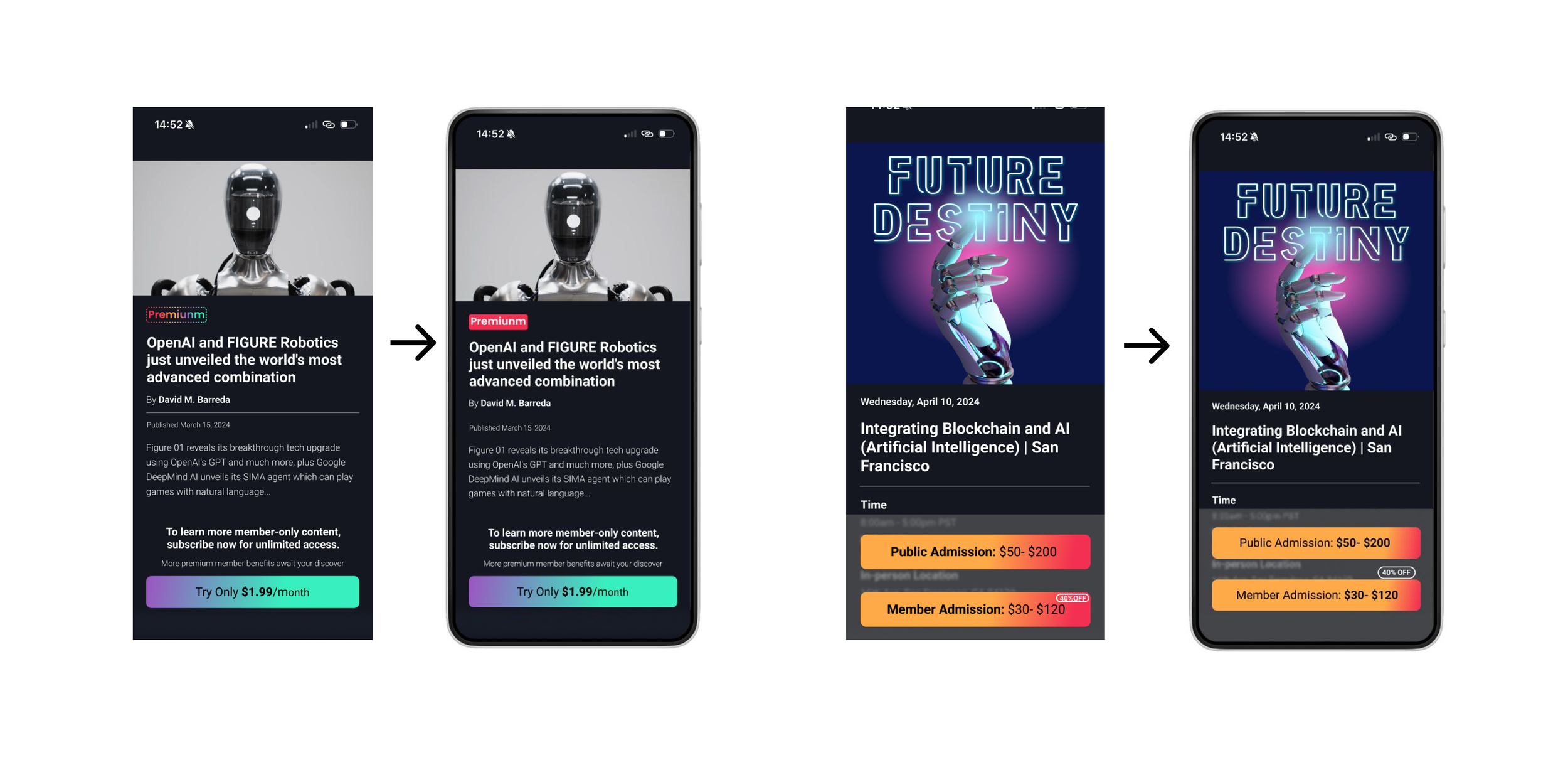
Exclusive Member Articles
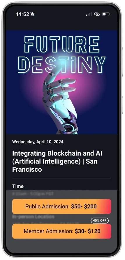
Discounted Event Access
Article Collecting
Free Trial Reminder
In-App Membership Entrance
Big Project
Access to Paid Courses
Blogger Interaction
Resource Downloads
Welcome Pop-Up
Individual Publisher Subscription
Ad-Free Experience
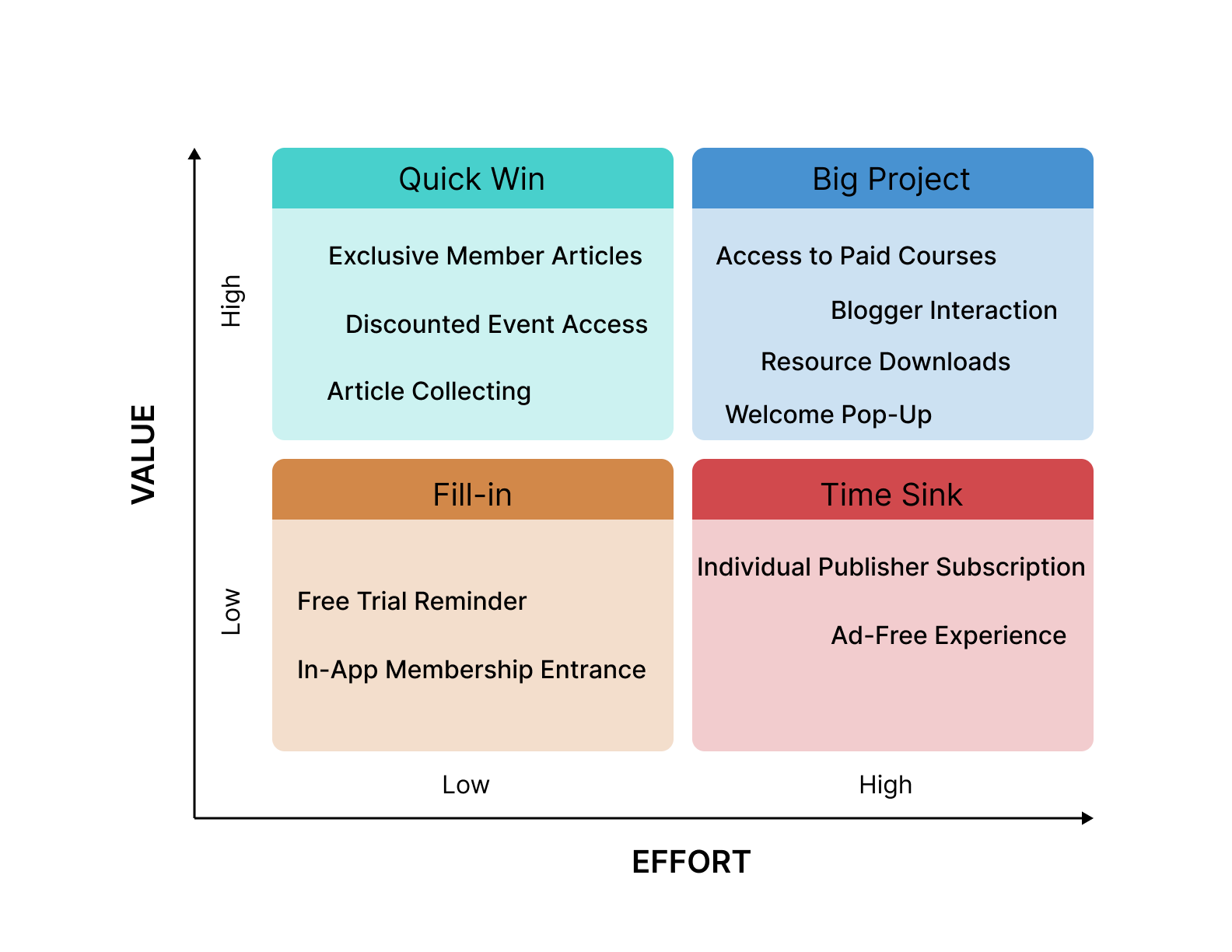
With the total project duration limited to 90 hours, I utilized a value/effort matrix to select three low-hanging fruit options, which were then used to create user flows.
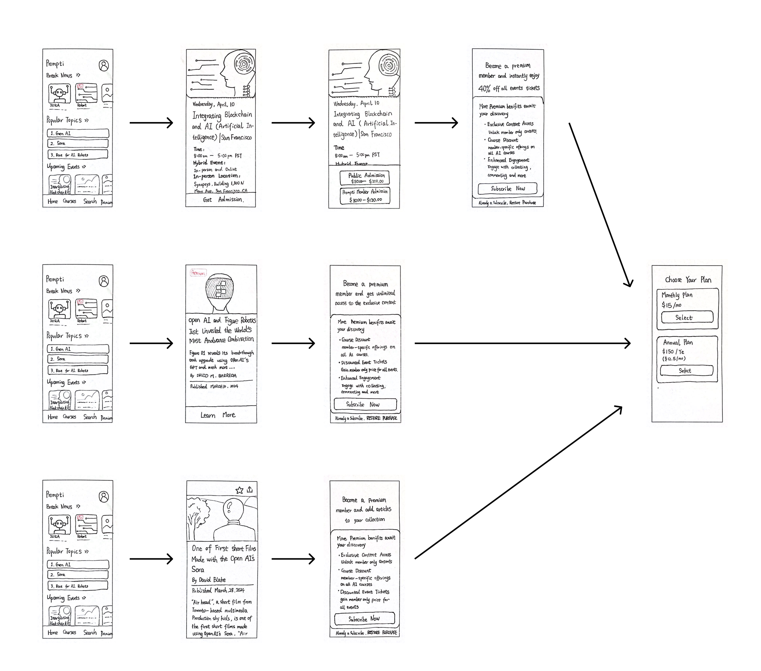
Low-fidelity sketching for efficient idea visualization and early testing
Sketch
Low- Fidelity plays a crucial role in UX design because it allows designers to quickly visualize ideas and concepts. At this stage, I selected sketching as my low-fidelity design method. By creating sketches, I can initiate usability testing earlier in the process, enabling them to identify potential issues at an early stage. This proactive approach helps catch problems before they become costly, ensuring that the design evolves efficiently while maintaining a focus on user needs. Additionally, sketching is a cost-effective method for exploring and iterating on various design options.
First Round of Testing
I conducted 3 moderated tests in-person and 2 tests via Zoom. There are 4 major goals for this test:
Gather initial impressions and feedback on screens within the app.
Identify and understand any usability problems in critical user journeys.
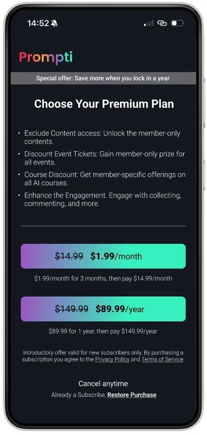
Evaluate the premium member purchase flow to ensure users can efficiently find and access.
Determine how well participants interact with the information hierarchy.
From the first round usability testing, I gathered several findings and prioritized them accordingly:

The high-fidelity design is for more precise feedback
High-fidelity design
After gathering feedback from the low-fidelity design phase, I got more confidence in my high-fidelity design. High level of detail helps gather precise user feedback and identify usability issues that might not be apparent in lower fidelity prototypes.

Second Round of Testing
In second round usability test, I conducted 1 moderated test in-person and 4 tests via Zoom. Because some of the user experience problems discovered in the first round of user testing have been fixed in high-fidesign. In the second round of testing, users generally responded that the entire journey was relatively straightforward and smooth. Most of the comments were about contrast.
Again, the findings are prioritized accordingly:

Iteration
According the findings uncovered through testing, I iterated my high fidelity designs.
Clickable Prototype
This is the prototype from Figma.
What I Learn
Working on the Prompti project has been an enlightening journey, teaching me valuable lessons in user research, feedback iteration. If given more time, I would explore additional payment flows and carefully consider balancing subscription revenue with retaining free users. If I were to redo the project, I would prioritize accessibility requirements and contrast demands earlier in the design process.