Design Sprint Case Study
Project duration: 12/18/2023 - 12/22/2023
House2Home is an e-commerce start-up specializing in selling home décor items and accessories, ranging from prints, posters and photos to lighting and small accent pieces.
The Context
The Problem
The Solution
My Role
Through customer surveys, House2Home has found that many of their customers have just moved into a new home or apartment. These users want to buy multiple items to personalize their new place. However, they don't feel confident doing it on their own. House2Home sees an opportunity for people to find a great 'starter kit' of items to instantly decorate their new place. In this design sprint, my focus will be on helping users who want a "starter kit" of multiple products to decorate a new apartment. This project is a modified GV design sprint, purposely adapted for solo work. As I will be making all the decisions alone, this approach will save on communication time and allow for the project's quicker completion.
Many people who just moved into a new house face the challenge of decorating their rooms in a style they like. It often requires significant time and effort to search for inspiration online and choose the right decorative items. However, the final result may still not always align with their initial expectations.
They commonly encounter three main challenges:
Achieving the “look” seen in reference images on Instagram or Pinterest often requires a big budget which they usually don't have enough.
Even with a clear idea and vision for their design, bringing that into the reality of their own living space can be very unsure and lead them don't know where to begin.
The time and effort involved in searching and selecting various décor items online can be overwhelming, causing many people to give up.
Through a modified five-day GV Design Sprint, I developed a simple and seamless solution that allows the users of House2Home to discover ‘décor kits' that are not only affordable but also can make a significant impact on their stylish living space. The design sprint's structured daily steps — map, sketch, decide, prototype, and test — enable quick decision-making, and user validation, reducing the risk of costly failures. The solution proposed is designed as a website, with the initial design focus on larger screens such as desktop and laptop computers.
Solo Designer – discovery, map the user flow, sketch, design, prototype and usability testing.
How Does My Design Sprint Work Step By Step
Zero-ing in: what is the real problems users are actually facing
Before kicking off the sprint, it is imperative to clearly define the problem this sprint aims to solve, ensuring that every subsequent step precisely serves this objective. To gain a deeper understanding of user needs and pain points, I listened to the recordings of user interviews and took detailed notes.
By thoroughly analyzing these interviews, I've identified the users' pain points and understood their feelings. This process is crucial for aligning the sprint steps with the users' perspectives and ensuring a user-centered design approach.
After synthesizing the insights of the user interview, I reframe the challenges into opportunity statements — How Might We questions:
HMW provide users with cost-effective solutions to achieve their desired "look" within a limited budget?
HMW assist users in confidently translating their design visions into practical and personalized style for their living spaces?
HMW simplify the process of finding and selecting décor items online to reduce the time and effort required?
Mapping: the possible end-to-end experience a user might have
n this design sprint’s first day, I jump right into imagining possible solutions. Drawing a map of a possible end-to-end experience is my first step. The user is one end, the goal they would like to achieve while using the product is the other end.
I envisioned two user flows for House2Home users. The first one involves using AI to identify items in a picture and find similar products. The flow would be:
Upload a reference image
AI would recognize the décor items
System would similar items in sale
User choose the items they want to buy
User add décor items to cart or check out
Alternatively, the second flow is according to the settings of budget and space characteristics to search for recommended kits. The user would:
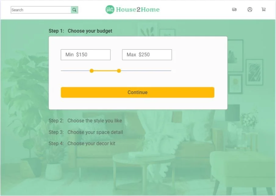
Choose the budget
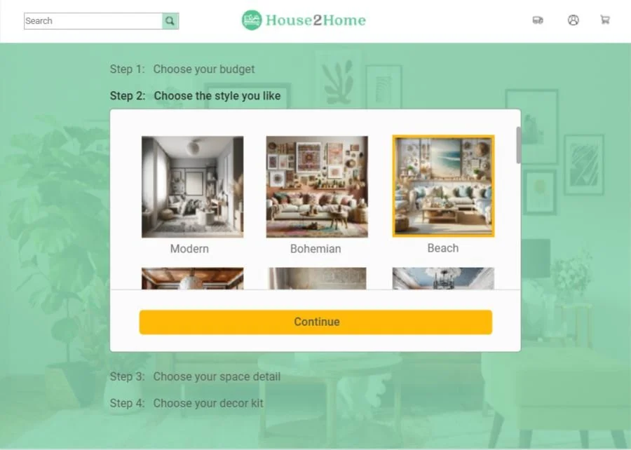
Choose the style
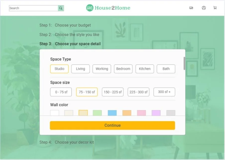
Choose the space details
Browse the best match décor kit the website find
Select the décor kit they want to buy
add décor kit to cart or check out
I ultimately chose the second user flow because, compared to uploading inspiration photos, the step by step flow is easier to complete for users on a computer. Additionally, this flow allows users to get more customized décor solutions by selecting their budget and specific characteristics of their living space.
Inspiration: conducting a solo-version lightning demo
The second day of the design sprint, I started to go through several existing websites to find great interactions that could inspire House2Home user experience.
Here are some solutions other great websites have produced to solve the similar problems.
This is the product results page for coffee tables on the West Elm official website. The images have a larger display ratio, contributing to the page's overall simple and elegant design. At the top of the page, there's a filter bar featuring drop-down menus and checkboxes on each tag, allowing users to select more precise categories according to their preferences.
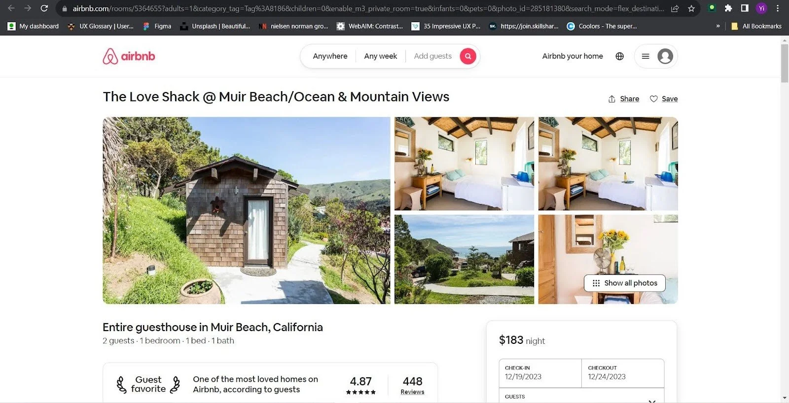
This is an Airbnb listing details page, illustrating how multiple images and text descriptions are organized together.
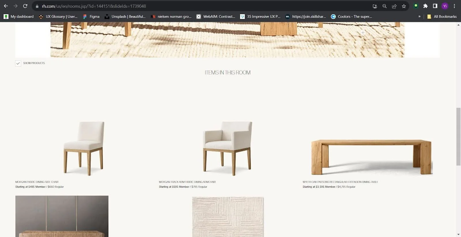
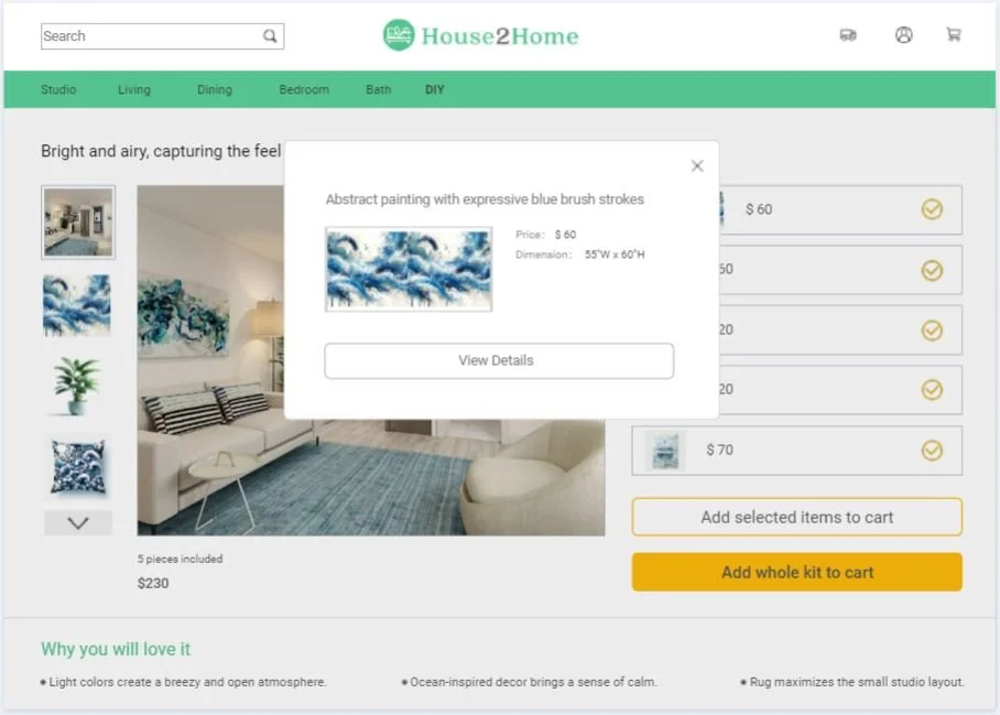
The official website of Restoration Hardware (RH) features a 'Shop by Room' option, which showcases each room with a large, impactful image. In these images, items available for purchase are indicated with a plus sign. Clicking on these signs pops up individual product displays, providing details such as price and more in-depth information about each item. Below the main room image, there is a comprehensive listing of all the products shown in the picture. This layout not only highlights the overall aesthetic of the room but also offers a convenient shopping experience, allowing customers to easily find and learn more about each piece that contributes to the overall design.
This describes the checkout page design of a website named Crate&Barrel. The layout follows a classic style commonly used by many e-commerce companies. Product information is displayed on the left side of the page, while the billing details and payment options are neatly organized in a box on the right side. This layout allows for a clear and efficient checkout process, making it easy for users to review their purchases and complete transactions.
Crazy 8's: Sketch possible solutions to the most critical screen
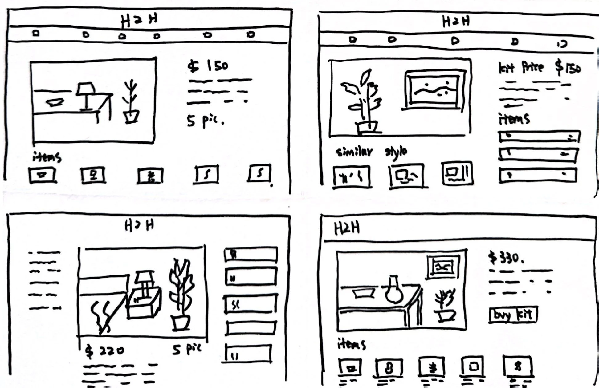
I consider the decoration kit detail page to be a critical component of our user experience. To optimize this page, I conducted a 'Crazy 8's sketching session, where I brainstormed and sketched out eight different versions.
After reviewing these iterations, I revisited user needs to guide my selection process. Through user interviews, I learned that many users appreciate reference images from platforms like Pinterest and Instagram, as the visual impact of these images is highly persuasive. This insight led me to prioritize the overall effect image as the main feature of the page.
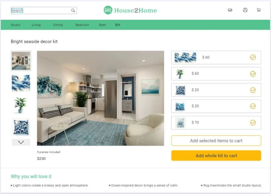
Additionally, the specific decorative items used in the kit are of interest to users and should be listed, though they should not compete for attention with the main image. Price details, including the total cost and individual item prices, are also crucial information. The ultimate goal of this page is to lead users to add items to their cart, making a clear and prominently placed 'add to cart' call-to-action button essential. These key pieces of information should be immediately visible to the user without the need to scroll. Therefore, from the eight solution sketches, I selected a combination of sketches 3 and 8.
Storyboard: create 8-panel solution sketch to visualize user’s journey
On the third day, I created an eight-panel board showcasing the user flow I chose on day 1. This storyboard is a lightweight, sketched wireframe that I’ll use to build my prototype on Day 4 of this sprint. Each screen includes the necessary UI elements that the user will need to have to complete the task they’d use the House2Home site to accomplish.
I divided the task of setting personalized parameters into four small, easily modifiable steps, effectively decreasing the DDP (Decisions Per Page). This approach minimizes the likelihood of users giving up before finding the suitable kit. Each step is shown within a size-restricted container, allowing for more options to be displayed through scrolling, preventing users from feeling overwhelmed.
Prototype: build “a realistic façade” to test with users
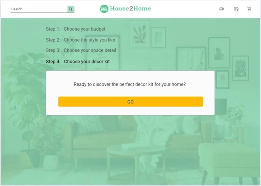
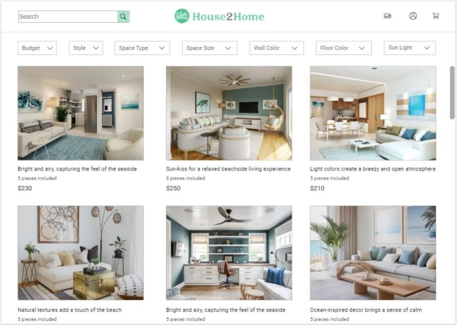
Building upon the sketched storyboard, on the fourth day of the sprint, I created realistic screens for the House2Home website using Marvel. This realistic prototype is instrumental in eliciting authentic user reactions, leading to more valuable feedback. At the same time, I remained conscious of the time constraints of the fast-paced design sprints. Keeping a balance between pursuing high fidelity and efficiency, I crafted a prototype for the fifth day's user testing that facilitates the completion of the main tasks and ensures smooth interaction, without getting bogged down in excessive detail.
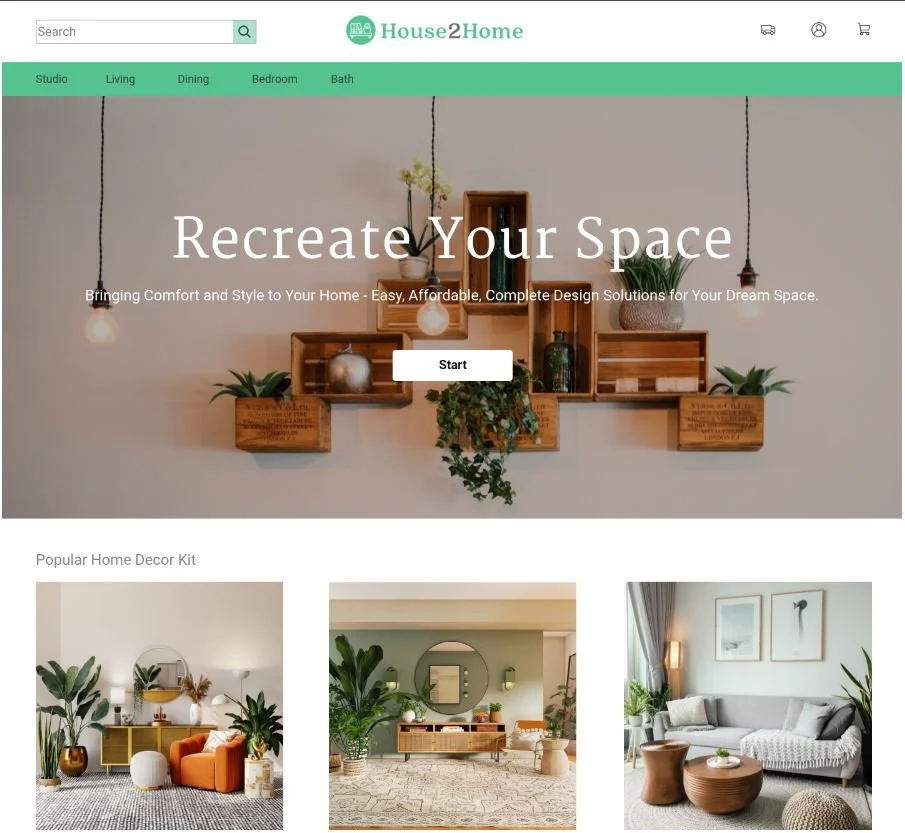
Home Page
Step 1 Page
Step 2 Page
Step 3 Page
Step 4 Page
Search Result Page
Kit Detail Page
Item Popup Window Page
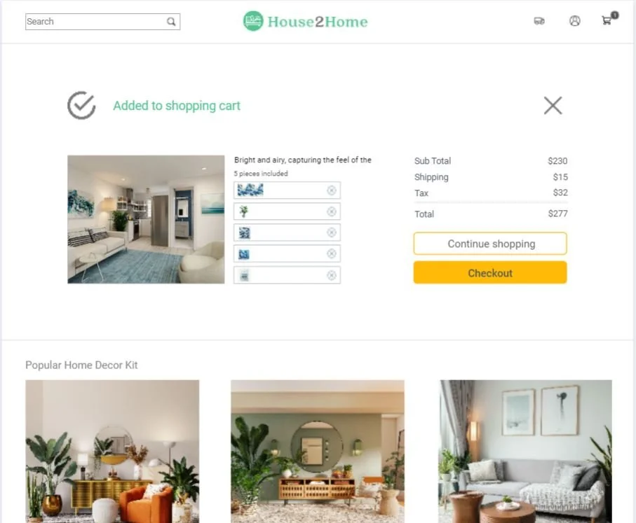
Added to Cart Page
This is a Clickable Prototype from Marvel.
Testing: validate my design and get feedback
On the fifth day of the UX design sprint, focused on testing, I conducted remote user tests with the prototype via Zoom. This involved presenting the prototype to 5 actual users, observing their interactions with it, and collecting their feedback. The aim was to validate the design decisions made during the sprint, assess the usability and effectiveness of the prototype, and gather insights on areas for improvement.
Based on the user feedback received, here are some key insights and areas for improvement:
Kit Detail Page Button: The 'Add Whole Kit to Cart' button is very prominent, leading to possible user errors. Users deselecting an item from the kit might still accidentally click this button. A redesign or additional confirmation step could prevent this.
Homepage Title Clarity: The main title on the homepage, 'Recreate Your Space', is somewhat confusing. Users may not understand what will happen next after clicking the 'Start' button associated with this title. This calls for a clearer and more informative title or additional explanatory text.
Navigation Bar vs. Starting Button: On the homepage, the green navigation bar is more eye-catching than the starting button, drawing user attention away from the intended start button. The starting button needs to be made more prominent.
Search Result Page Filters: The current filter layout on the search results page could be simplified. Instead of displaying all filter options upfront, a single filter icon button could lead to an overlay with detailed filtering choices. This suggestion offers an alternative way to present the filter options.
Post-Addition Navigation: After adding décor kits or items to the shopping cart, users have the option to 'Checkout' or 'Continue Shopping'. It's worth reconsidering which page users should return to if they choose to continue shopping – whether it's back to the kit detail page or the search results page.
What I learnt from this design sprint
This sprint was not only about delivering a design solution but also about the invaluable lessons in user-focused design, rapid design and prototyping, iterative development, and efficient time management.
Centering the design process around the users' needs and preferences is always the most important base of UX design , even in the fast-pace sprint design process.
Defining specific goals and challenges I want to address helps me keep on the right track during the sprint .
The sprint taught me valuable lessons in managing time efficiently, focusing on essential tasks to meet tight deadlines without compromising the quality of the design.
Documentation is important. Keeping detailed records of ideas, decisions, and user feedback is usesful for future reference.
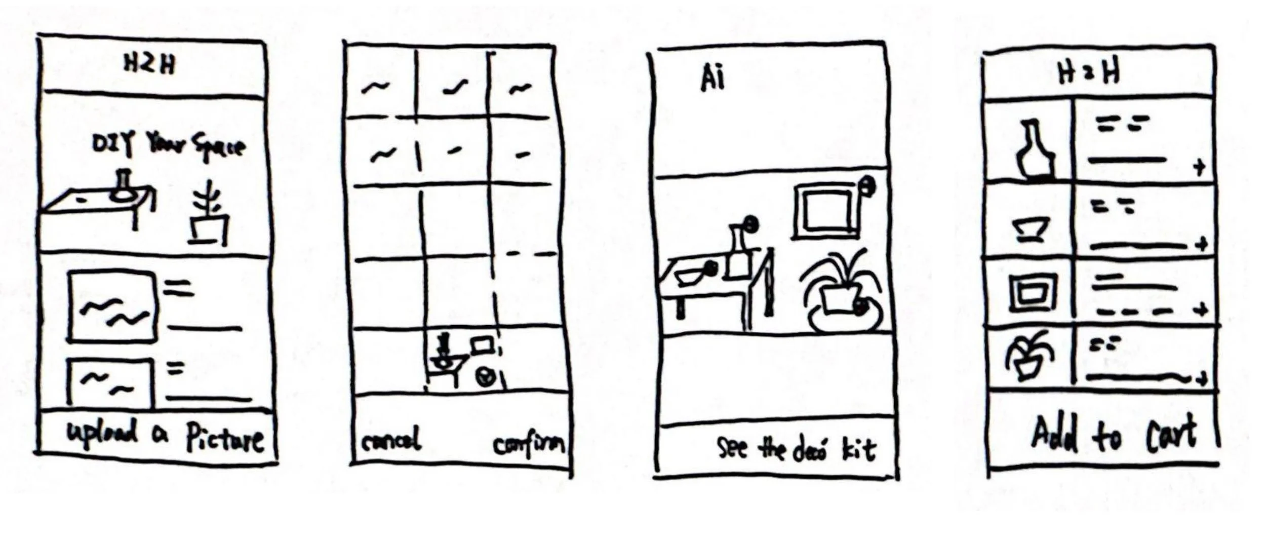
In addition, AI is becoming stronger and smarter in recent years. The first of my two user flows is to use AI to identify décor items in inspiration pictures. It may be a more intuitive choice for mobile phone users. This design sprint is required to focus on large screens like laptops. However, the solution for mobile platforms, enhanced with AI image recognition, is also worth considering. These are sketch screens I created for the mobile users of House2Home.

