
Drawing Journey

The drawing on the left was created by my son when he was 4 years old. What he depicted and whether there was a magical story behind it, have faded from my memory. As time passes, even himself might no longer recall. Time, inevitably, will submerge it—whether we lose the physical drawing in a move, or it gradually becomes a seemingly meaningless image buried in the smartphone memory.
As a mother, on the swift journey of my children's growth, I always try to grasp onto moments, such as his imaginative drawings. Imagine one day in the future, as I open his drawing on my phone, there, alongside it, appears a video of the little him from many years ago, telling the stories behind the drawing with his kid voice—I am certain tears would fill my smiling eyes.
The problem
The solution
My role
Many parents, even with their demanding schedules, willingly take time to digitally archive their children's artwork through photography. However, the reality is that a picture of drawing can lose its story and meaning behind over time. The core objective of my design for the Drawing Journey app is to help parents infuse these electronic archives of artworks with more vivid and engaging narratives. Parents can now save their children's artworks alongside presentations or narrative videos or audios, preserving contextual stories and sharing them within the family. Making the adding process streamlined and intuitive, while keeping those digital archives organized and searchable was the challenge throughout the design process.
Based on the design thinking methodology, including the stages of empathize, define, ideate, prototype, and test, I successfully developed high-fidelity mockups for two critical user flows: adding a new drawing with child's presentation, and reviewing an old drawing along with its associated saved video.
Solo Designer – discovery, user research, information architecture, design, prototype and usability testing.
Discover
Competitor analysis

Artkive
This is a personal motivation-driven project and I need to build everything from scratch, so I must ask myself two questions from the very beginning: ‘Am I designing the right thing?’, ‘How do I design this thing right?’
In the early discovery stage, I first conducted a secondary research to get a better understanding of the problem space might explore, and scoped out similar apps, like Keepy, Artkive, and Qeepsake, that might offer competing solutions to the solution I’m considering for my project. Through competitor analysis, I observed that their visual designs tend to be more conventional, with distracting advertisements that cannot be easily dismissed . Most importantly, none of them achieved the seamless integration of kids’ drawings with their narratives, which are the key aspects I envisioned. Nevertheless, these mature apps provided me with many inspiring considerations such as visibility of system status, user control and freedom, and consistency and standards.

Keepy

Qeepsake
Semi-Structured user interview
This is a personal motivation-driven project and I need to build everything from scratch, so the first question to ask is ‘Am I designing the right thing?’ User interview is a qualitative research approach allowing me to directly engage with potential users- parents, uncover their preferences, and gain deeper insights. It also can answer the next key question: “How do I design this thing right?” Based on the two key questions, I created an interview plan to ensure the research objectives, expectations, and questions are crystal clear. I utilized a screener survey to make sure that I'm conducting research with the right participants who will help me to collect viable data.
Through interviews, I discovered that 20% of the interviewed parents shared the same concern as I did – that merely taking photos cannot be considered a comprehensive way to preserve their children's artwork. All of the parents expressed the belief that there should be a better way and contributed many valuable insights after I described the intent and vision of the Drawing Journey app.
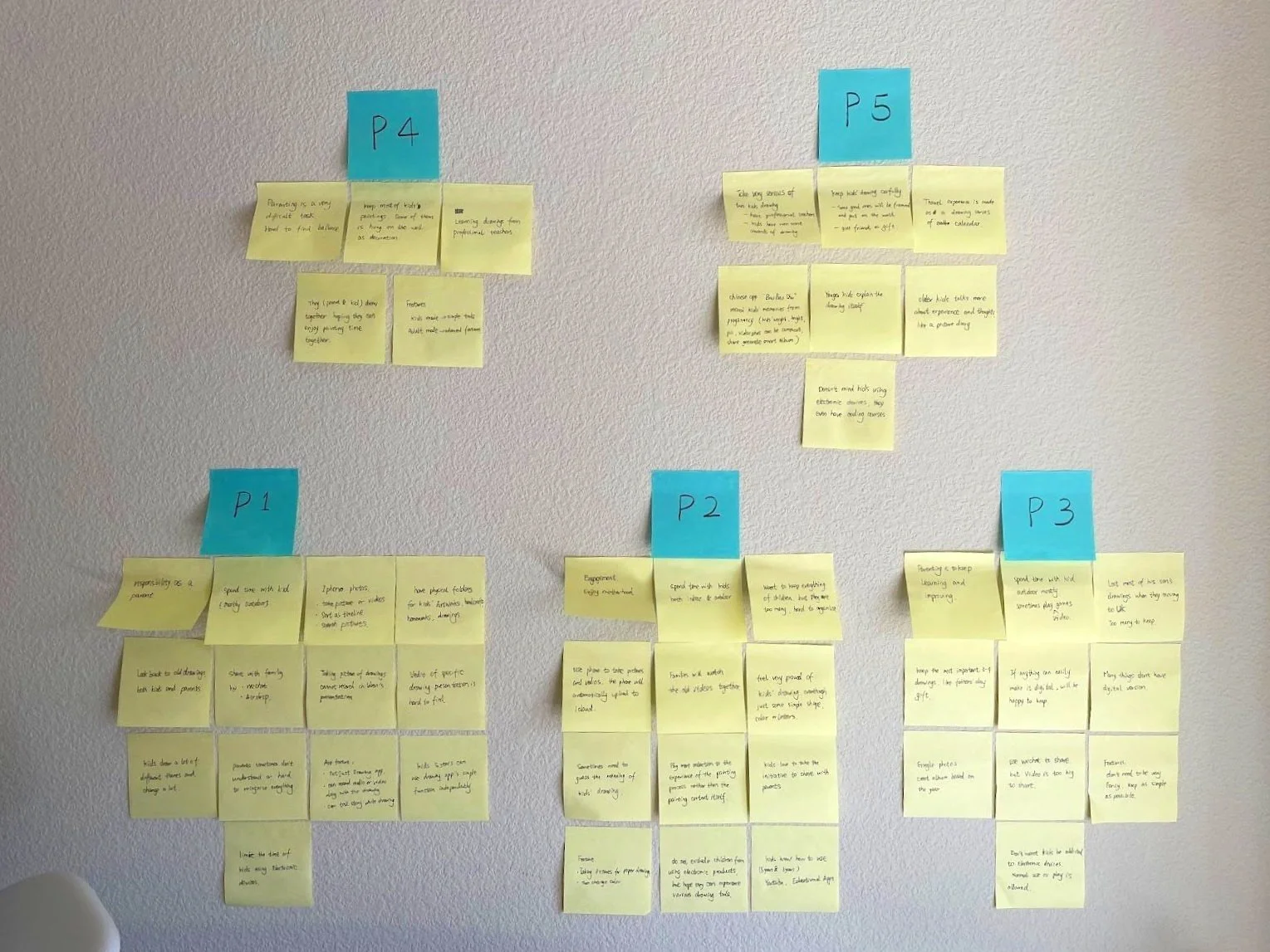
Affinity map
Synthesis is the key to making sense of the data I collected in the Interview so that I can then move on to the ideation stage of the design process. Affinity map can help me take an array of data and restructure it into a handful of insights to prioritize those insights.
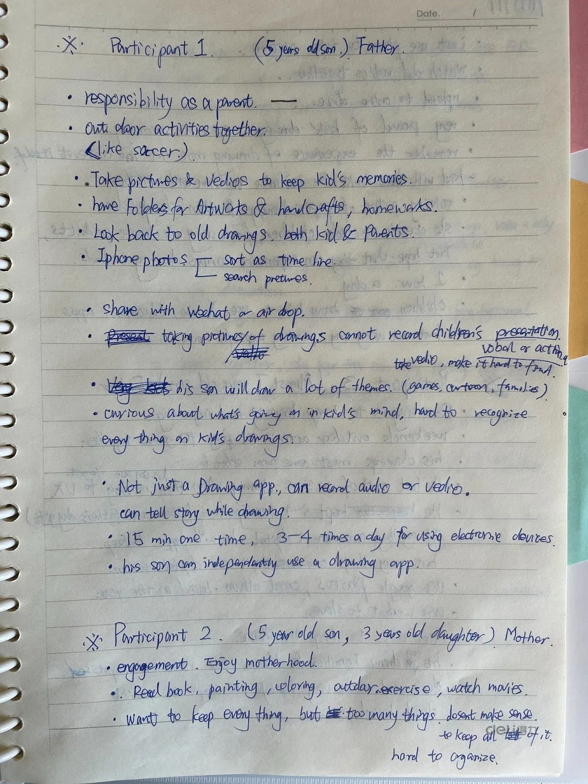
I recorded all the interviews and transcribed each participant's conversation into written notes based on the audio recordings.
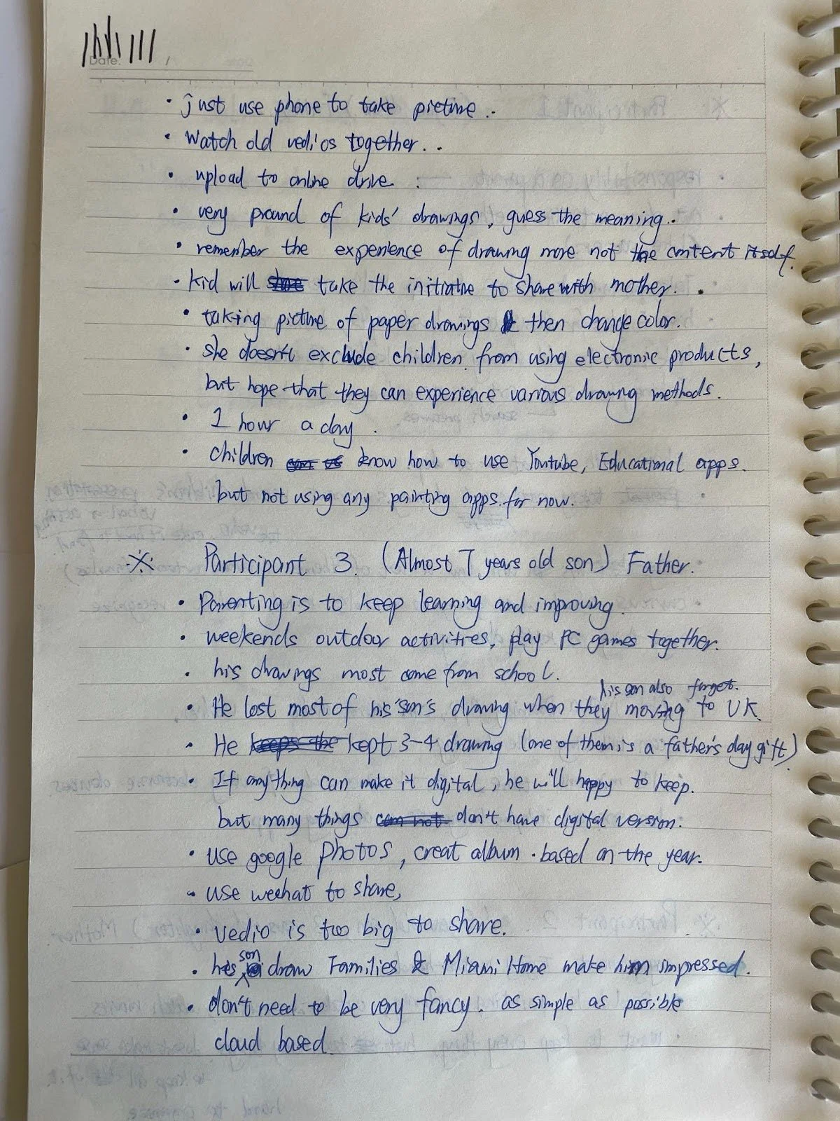
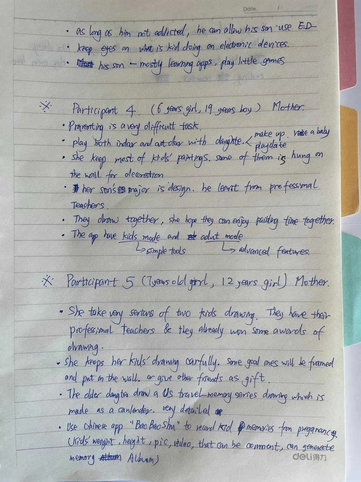

I coded a brief description of the interview content, simplifying and shortening the text, and then eliminated overlapping and unrelated information. I used post-it notes to organize each code, sorting them according to the participants.
After generating some new themes, I reviewed all codes to explore relationships, differences, and similarities. I organized all codes into thematic groups and established an affinity map.

Empathy map
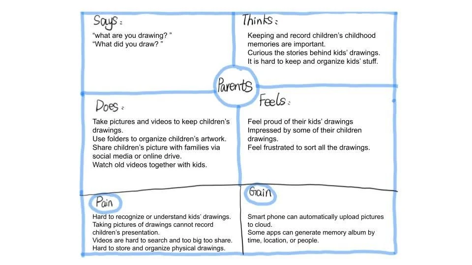
I use the empathy map to visually organize insights, observations, and quotes collected from the user interview to better understand parents’ pain points, goals, feelings, thoughts, and behaviors. Empathy maps also can help me to create a persona for my users. and bridge the gap between the persona and my design concepts.
Persona
I created a persona, Alice, she is 33 years old, mother of two kids. Even though she is very busy, she is still willing to take the time to preserve and organize her children's artwork. This personas clearly identified the goals that need to be met and the problems that need to be solved.

How Might We questions
By synthesizing all the research and developing insights, I have identified problem areas that pose challenges for parents who wish to save their children's drawing with the accompanying explanatory videos together. Then I reframed all insight statements as How Might We questions to turn those challenges into opportunities for design and give me a perfect frame for innovative thinking:
How might we help parents store the combination of children's drawings in the least amount of time and space?
How might we help parents to spend the least time in organizing their children's paintings into categories?
How might we make the combination document of children's drawings and stories easy to share and review for parents?
Design
Ideate
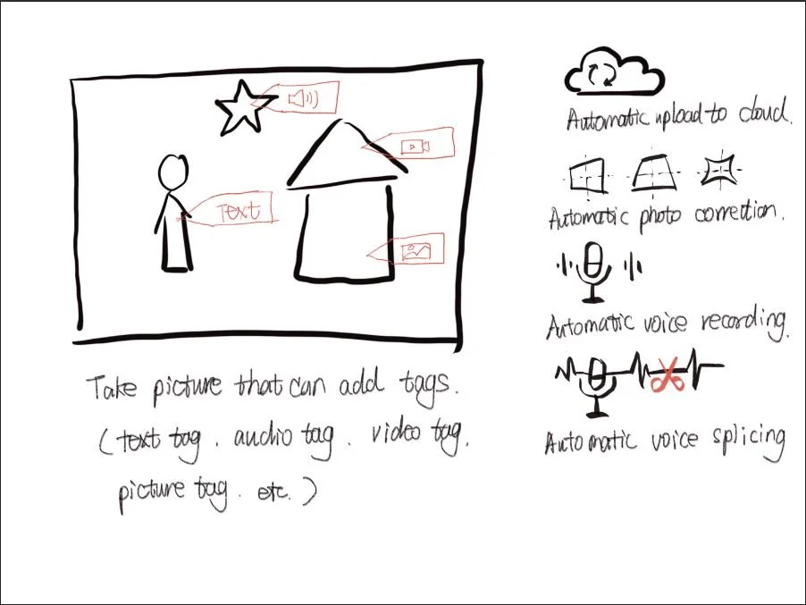
After conducting research to define the problem, it's time to start brainstorming solutions. Draw a sketch as the brainstorm is really helpful in this divergent thinking process. I sketched the solutions for my three HMW questions.
User stories

After conducting research to define the problem, it's time to start brainstorming solutions. Draw a sketch as the brainstorm is really helpful in this divergent thinking process. I sketched the solutions for my three HMW questions.
Information architecture

Ensuring effective information architecture is crucial to prevent the app's information, content, and features from becoming disorganized and overwhelming users. It also helps me arrange the parts of a product to make it more understandable as a whole.
I kept track of all of the different screens within a sitemap and visualized how they are all connected. it are laid out in a way that represents the hierarchy of the app.
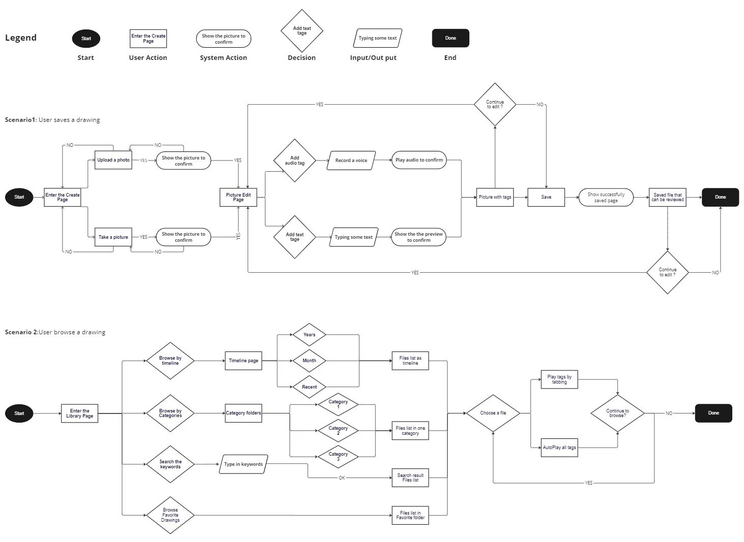
I identified two critical red routes that are related to the core of the Drawing Journey app. One is adding a new drawing or artwork photo along with attaching a child's narration video or audio. The second route is searching for past drawings and their associated stories. I created user flows for both red routes.
Sketch
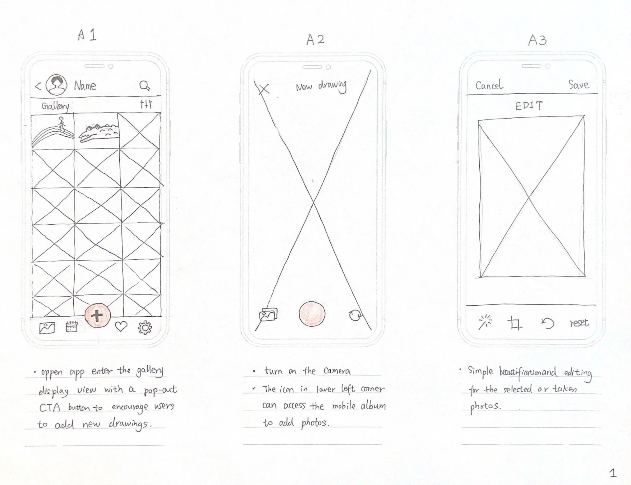
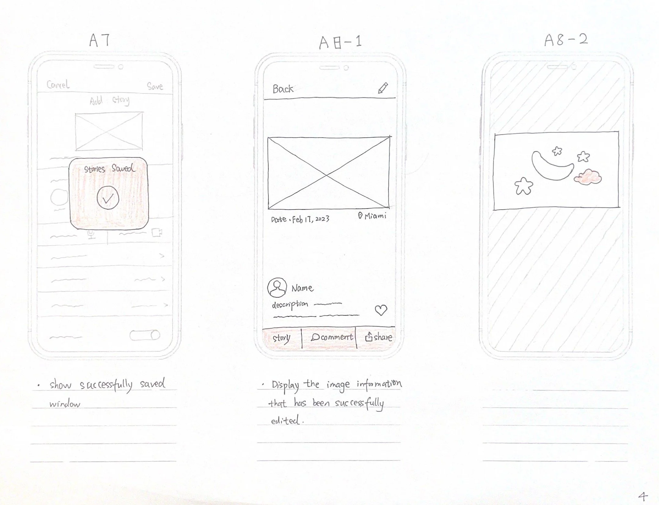

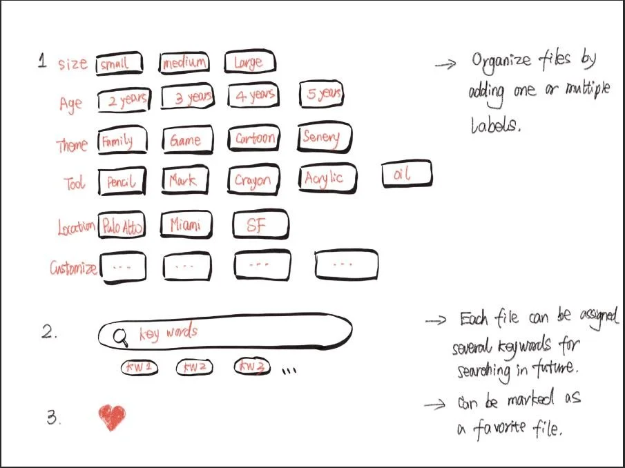
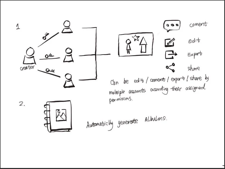
Sketching is a very efficient way to make my ideas tangible so that they can be tested and adjusted before I make higher fidelity versions ,such as through wireframing and prototyping. Sketching allows me to try out a multitude of ideas and iterate them before settling on one. Based on the two red route user flow I drawed, I drew a series sketch of the screens for the Drawing Journey app.


People most commonly interact with apps through their mobile devices. In fact, more than half of all sites are accessed through mobile, which is why I choose mobile-first design. However I still sketched two screens for the tablet user to get a quick glimpse.

Guerilla Usability Testing and Iteration

I conducted Guerrilla Usability Testing with several of my friends and family at my house. Some of them know more about my products, and some are the first contact. In this way, relatively speaking, some different perspectives can be obtained.
The primary goal of this Guerrilla usability test is to evaluate the user experience and identify any usability issues in the app's design. I described two possible scenarios to the testers: First, your child has drawn a complex and stunning drawing, and you want to document the drawing electronically, along with a video of him telling the story of the drawing. Second, you saved one of his paintings two years ago, and now you want to find him and review the video recorded at that time.
I find a crucial problem: the biggest highlight of this app is to electronically archive the children's paintings while displaying the video or voice of the children when they showed and described the paintings at that time. Therefore, this feature is not displayed on the gallery page when the first users enter the app. At the same time, on the display page of a single painting, there is no emphasis on displaying the story description with video or audio. Just have a story button in the bottom left corner.
I also find some small problems in details: such as using the same icon to represent different functions. Some icons have unclear meanings and require text comments. The button’s name needs to be polished. The day/month/year space on the timeline page is too small, etc.
So I made 3 iteration sketches for the key screen:
Wireframe


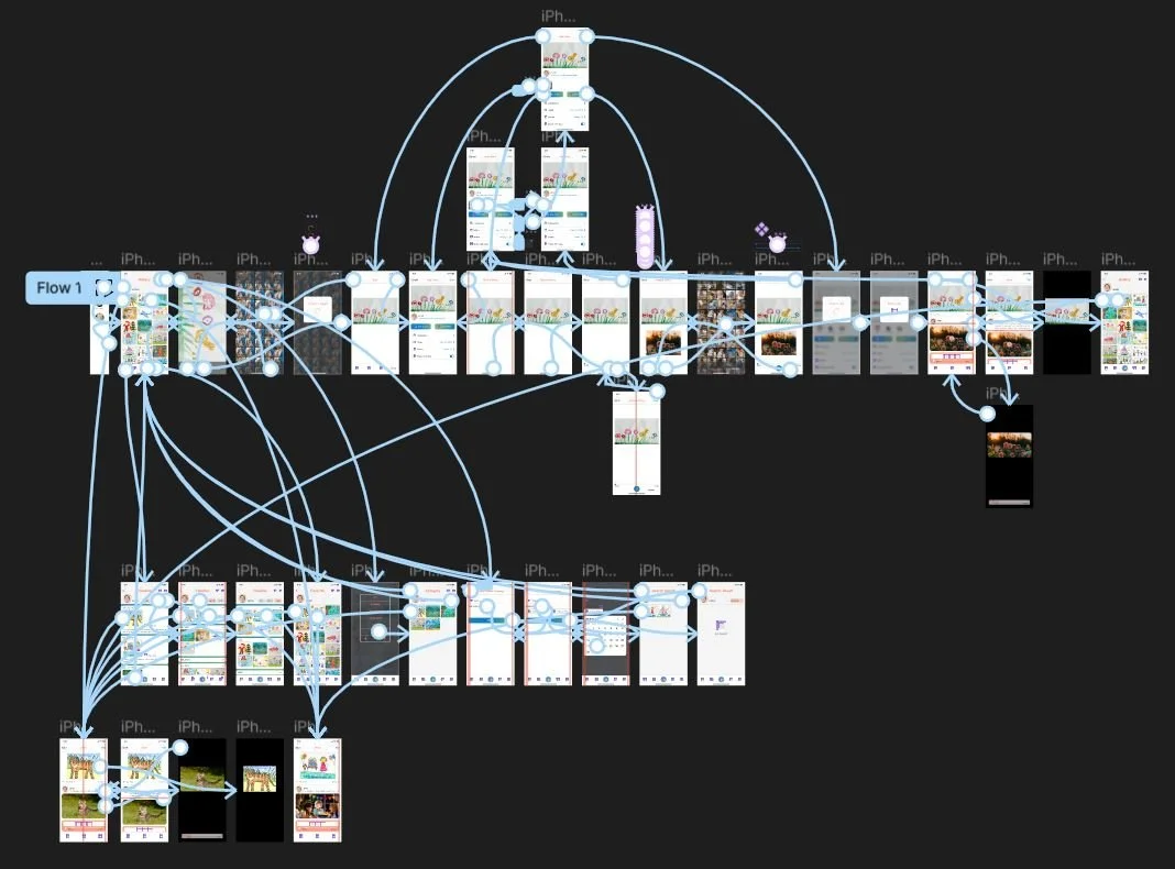
I developed wireframes to establish the hierarchy of elements within the product to determine the overall layout. Building upon the foundation of the two red route user flows, I then created wireflows to visually represent the points at which a user will interact with the various components of the product.
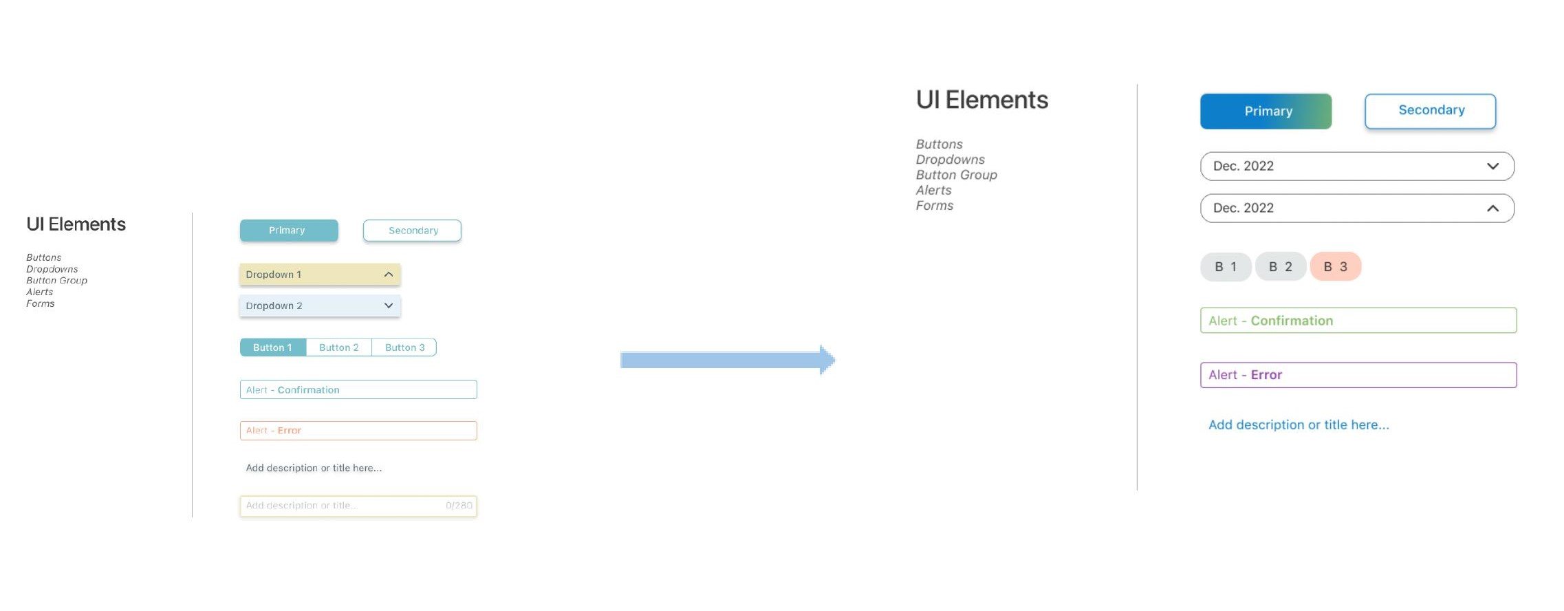
Style Guide

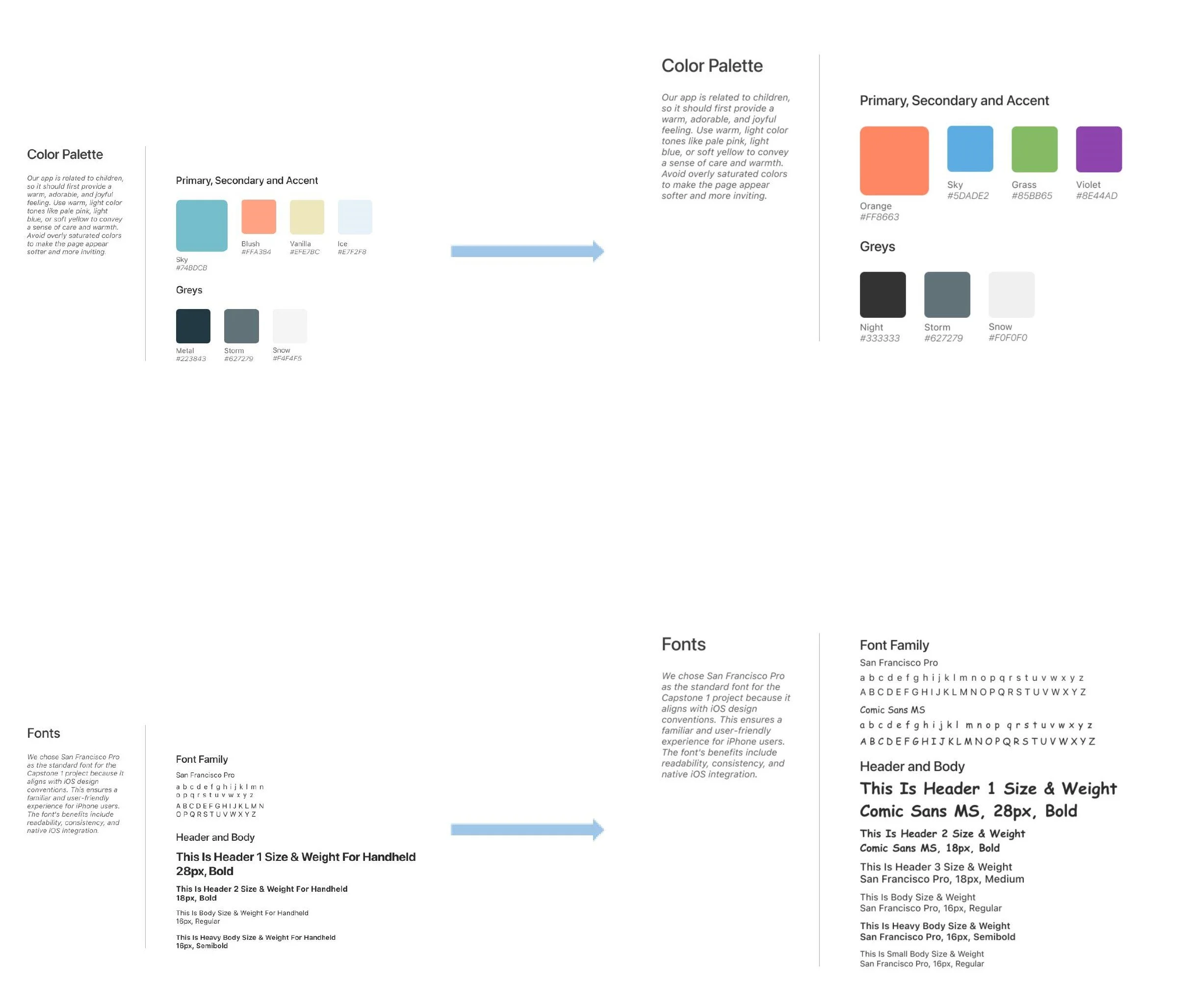
I have bestowed a brand personality upon this app: The app is envisioned as a reliable and creative memory keeper, dedicated to preserving cherished moments and showcasing children's artistic journey through a seamless blend of creativity and technology. I have defined several brand attributes, including Caring, Organized, Trustworthy, Connected, and Amusing. Based on these, I have established the Style Guide for the Drawing Journey app.
High-Fidelity Mockup


High-fidelity designs offer a simulation close to the final product's appearance and functionality, allowing users to interact with a more authentic representation. This aids in collecting more accurate user feedback as users can better comprehend how the final product will be used.
I chose Figma as my main design tool. In the creation of high-fidelity mockups for the Drawing Journey app, I translated the identified two red route user flows and wireframes into visually polished and refined interfaces. I paid careful attention to the incorporation of brand attributes such as Caring, Organized, Trustworthy, Connected, and Amusing. The design process involved a consideration of color schemes, typography, and iconography to ensure a harmonious user experience.
In my design approach, I created 3-4 screens as an initial step to prompt adjustments for accessibility considerations and gather feedback and critique. This iterative process also allowed me to return to refine the established style guide.


Validate
Prototype
Validation, in my whole design process, is crucial for ensuring user satisfaction, identifying potential issues, and optimizing the overall user experience. It facilitates iterative improvements and provides objective data to support design decisions.
In the process of creating prototype animations, I still chose Figmal. Transforming high-fidelity designs into interactive prototypes, I employed Figma's animation features to simulate user experiences and interactions. . Throughout this phase, my focus remained on maintaining consistency and usability in the user interface to deliver an optimal user experience.
Usability test


I conducted two rounds of remote moderated usability tests, starting with participant recruitment and the preparation of a detailed script outlining tasks and scenarios. Throughout the testing process, I observed participants interacting with the design, collecting various feedback and insights.
Following the First round of usability tests, I prioritized and organized identified issues based on their severity. This involved addressing critical concerns and implementing improvements to enhance the overall user experience.


What I learn
Embarking on my first UX design journey, I learned that the UX design is a continual, iterative process. This involves a cycle of crafting designs, seeking feedback, making adjustments, and repeating these steps until the designs reach their optimal state. In the process of designing the Drawing Journey app, user-centered design principles always guide me by placing the needs, preferences, and experiences of users at the forefront. Through this endeavor, I not only honed my skills in design thinking, usability testing, and prototype development but also learnt to keep the balance between perfection and time management in the design process.


